Pomegranate Kitchen
Product Illustration System
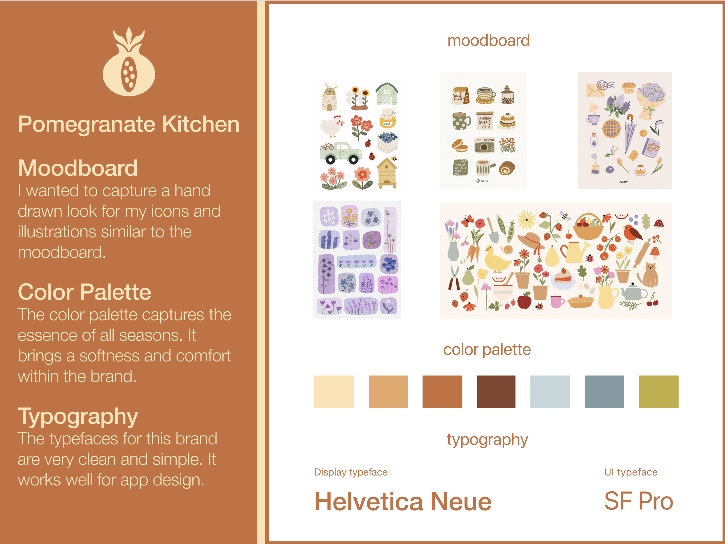
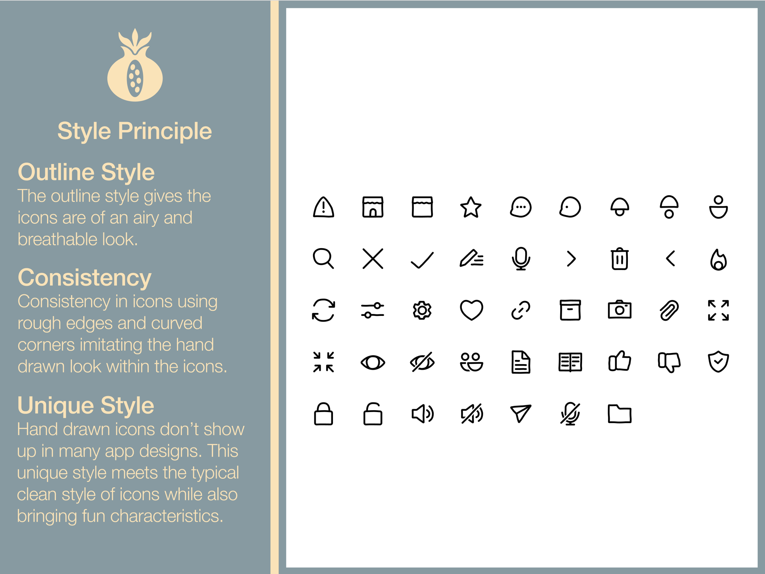
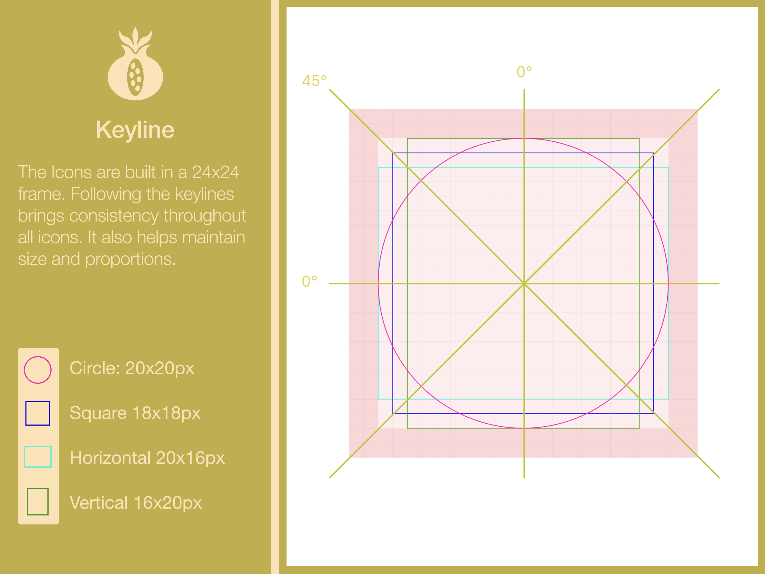
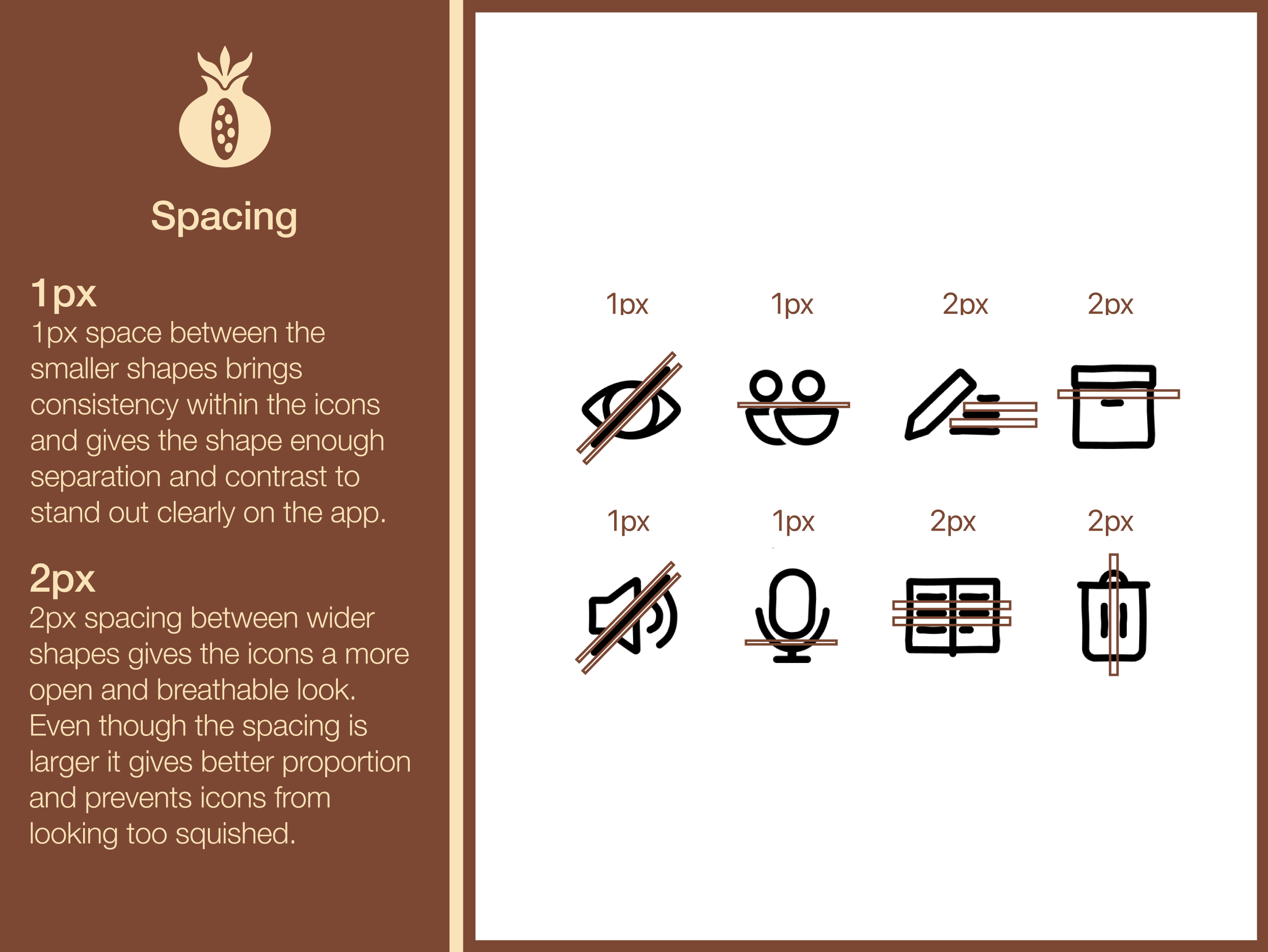
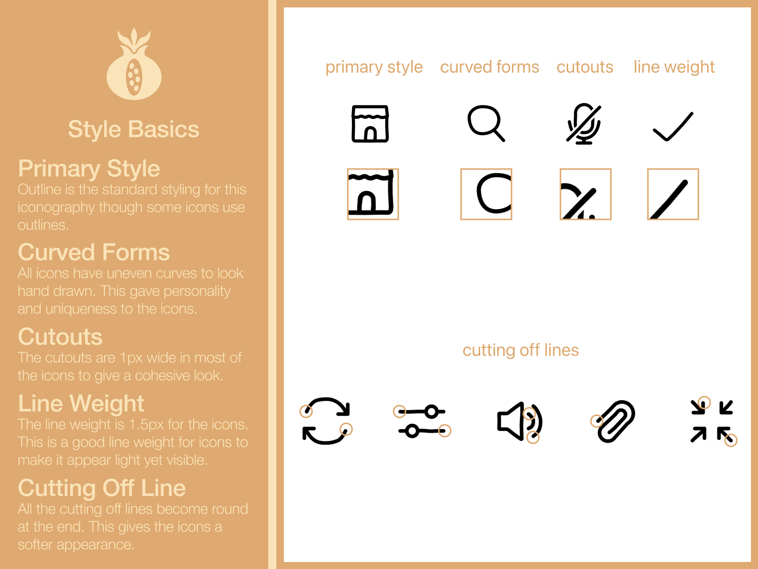
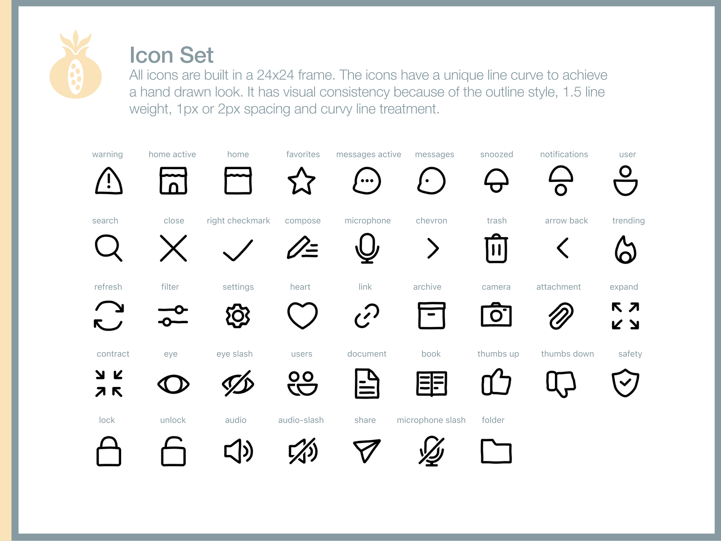
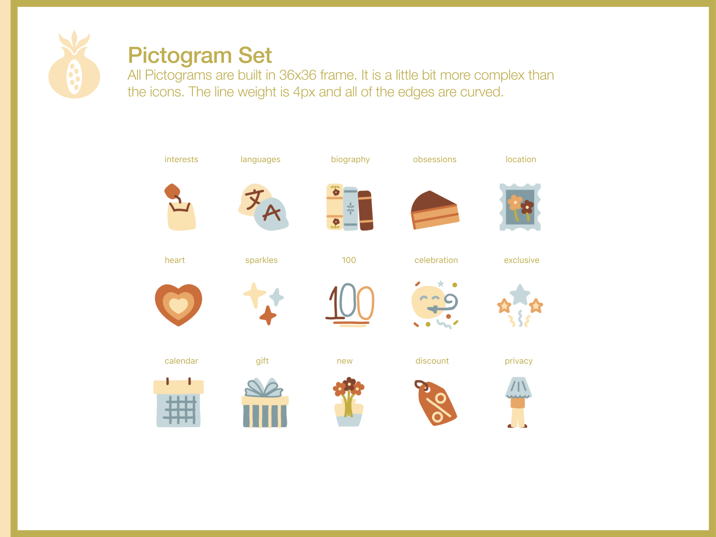
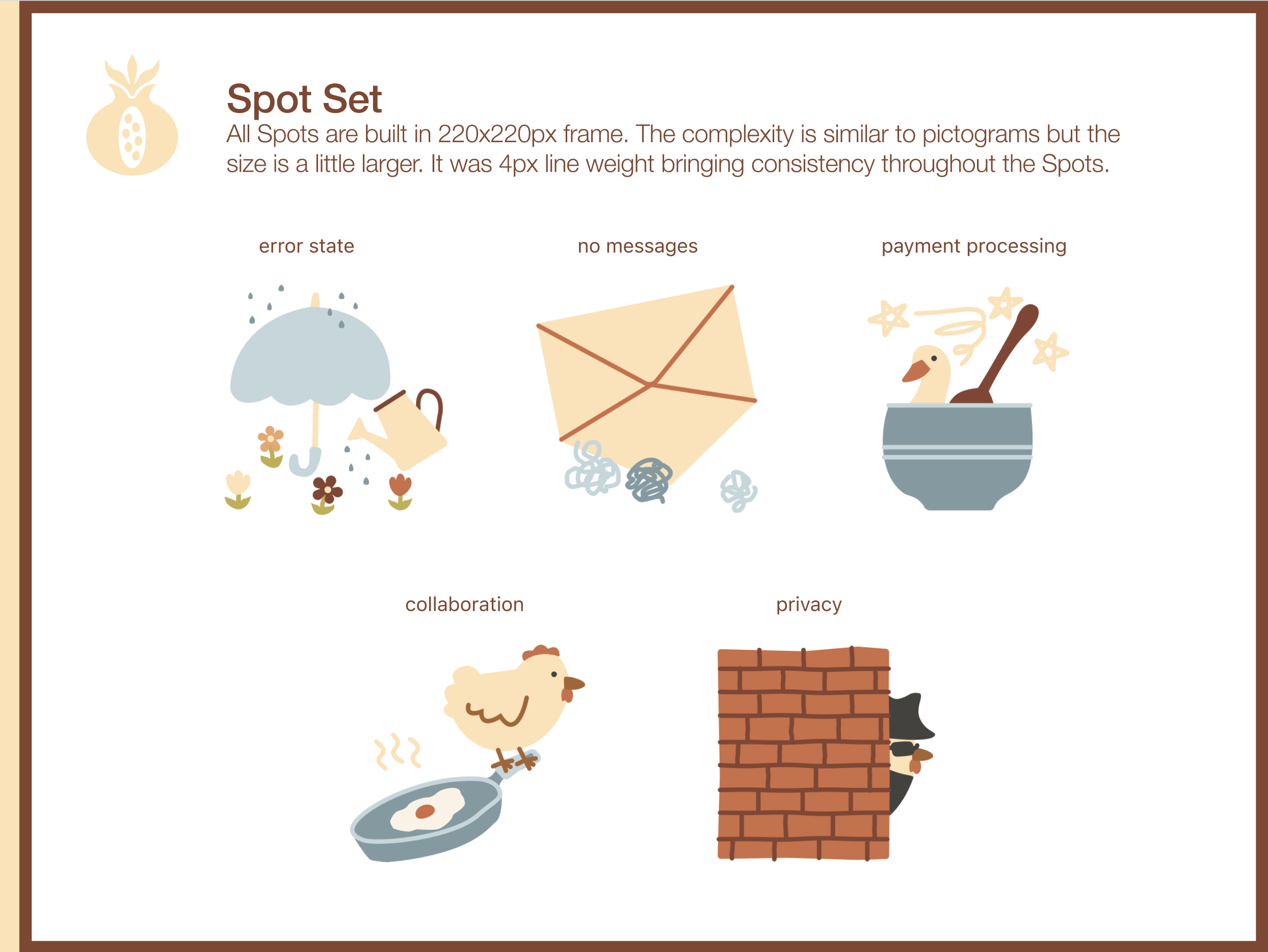
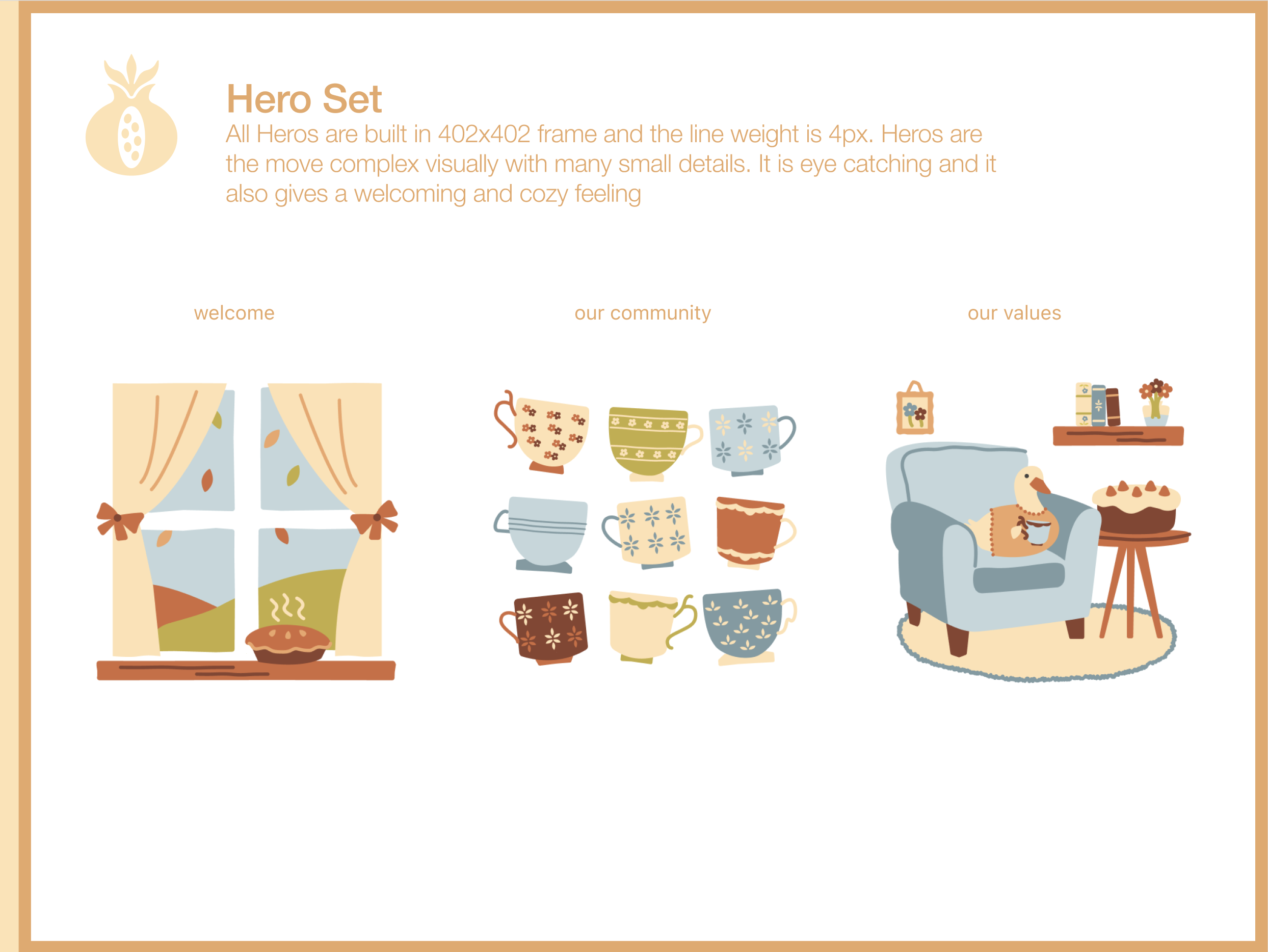
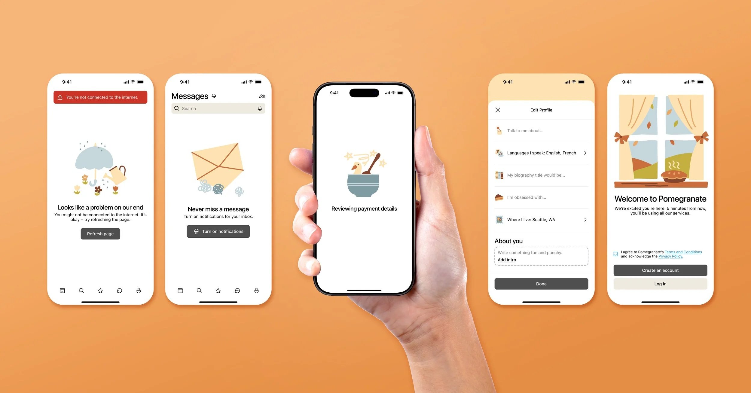
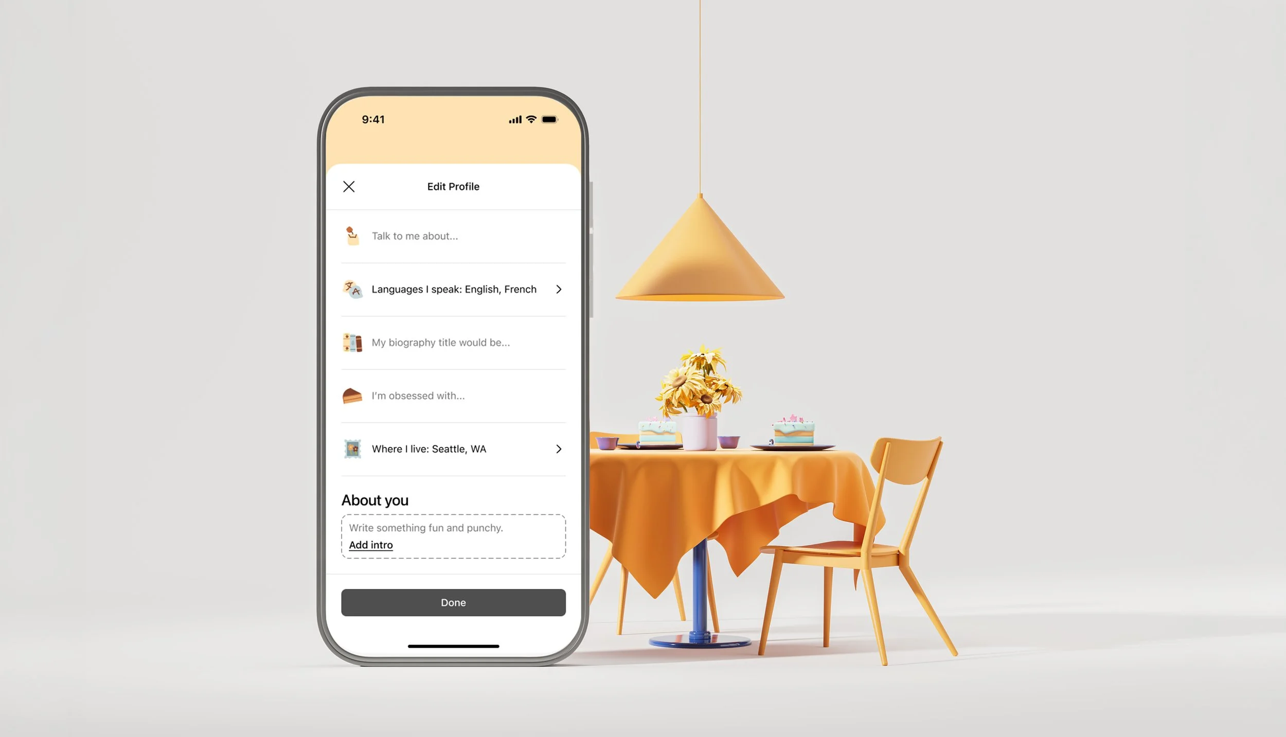
Pomegranate Kitchen is a fictional culinary brand centered around warmth, comfort, and seasonal charm. The product illustration system features a hand drawn aesthetic combined with clean, legible iconography for digital use. Airy outline styling, curved forms, and subtle cutouts create softness and personality throughout the icons. Consistent spacing, rounded line endings, and balanced proportions maintain clarity across mobile screens. The system scales from simple icons to more detailed pictograms and hero illustrations, forming a cohesive visual language that feels cozy, approachable, and visually unified.
Goal
The goal of this project was to develop a cohesive illustration and icon system that balances a hand drawn style with clarity and usability. The icons were designed using consistent line weight, spacing, and curved forms to create a soft and welcoming feel while remaining readable at small sizes. By building icons, pictograms, and hero illustrations with increasing levels of detail, the system maintains visual consistency across different scales. The overall aim was to create a unique yet functional style that adds warmth and personality to the Pomegranate Kitchen brand while working effectively in an app environment.
Color Palette
Typography
Helvetica Neue
SF Pro
Tools
Figma
Express
Credits
Student: Massah Johnson
Instructor: Bonnie Kate Wolf
Tyler School of Art and Architecture, Temple University

Guidelines