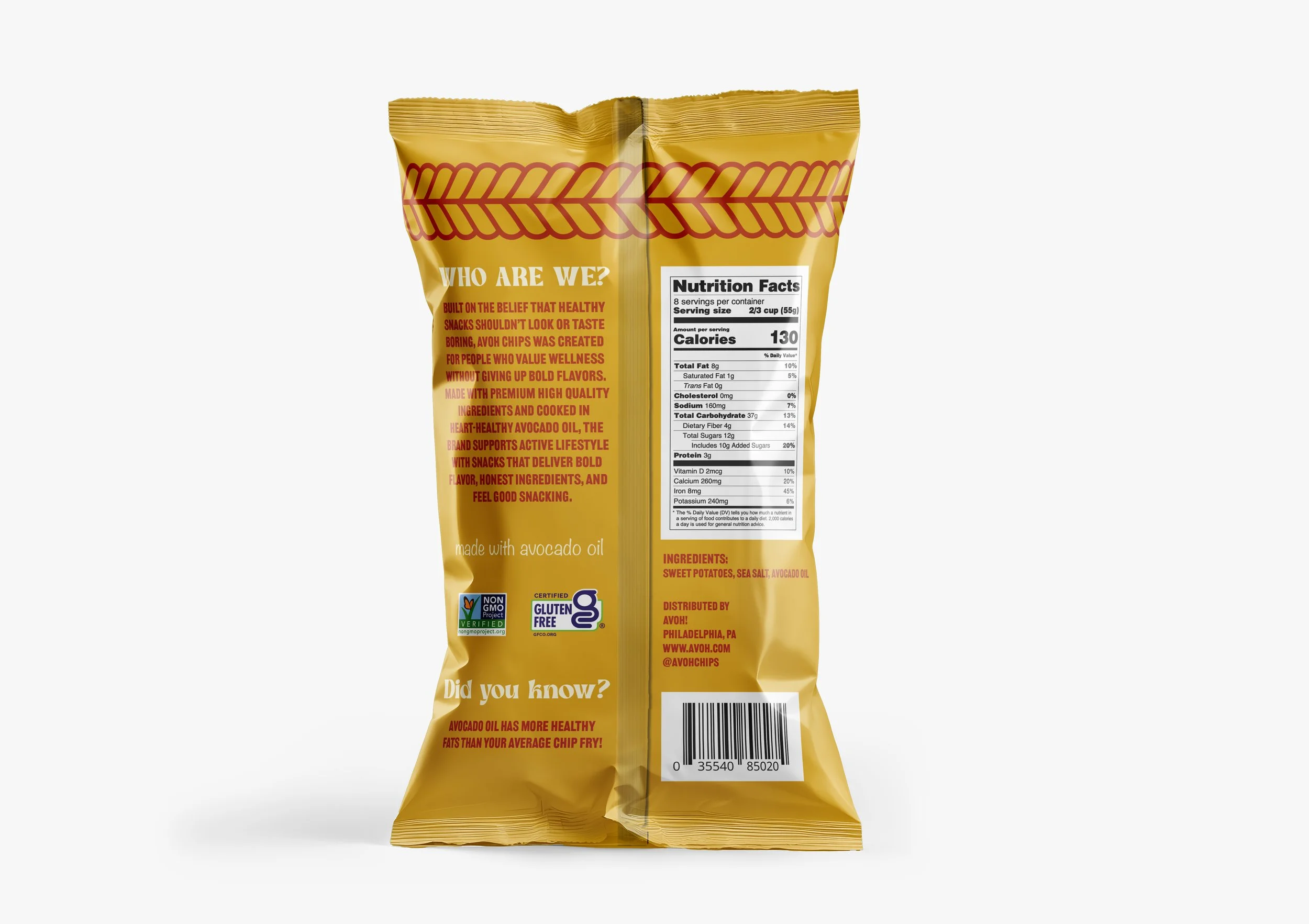
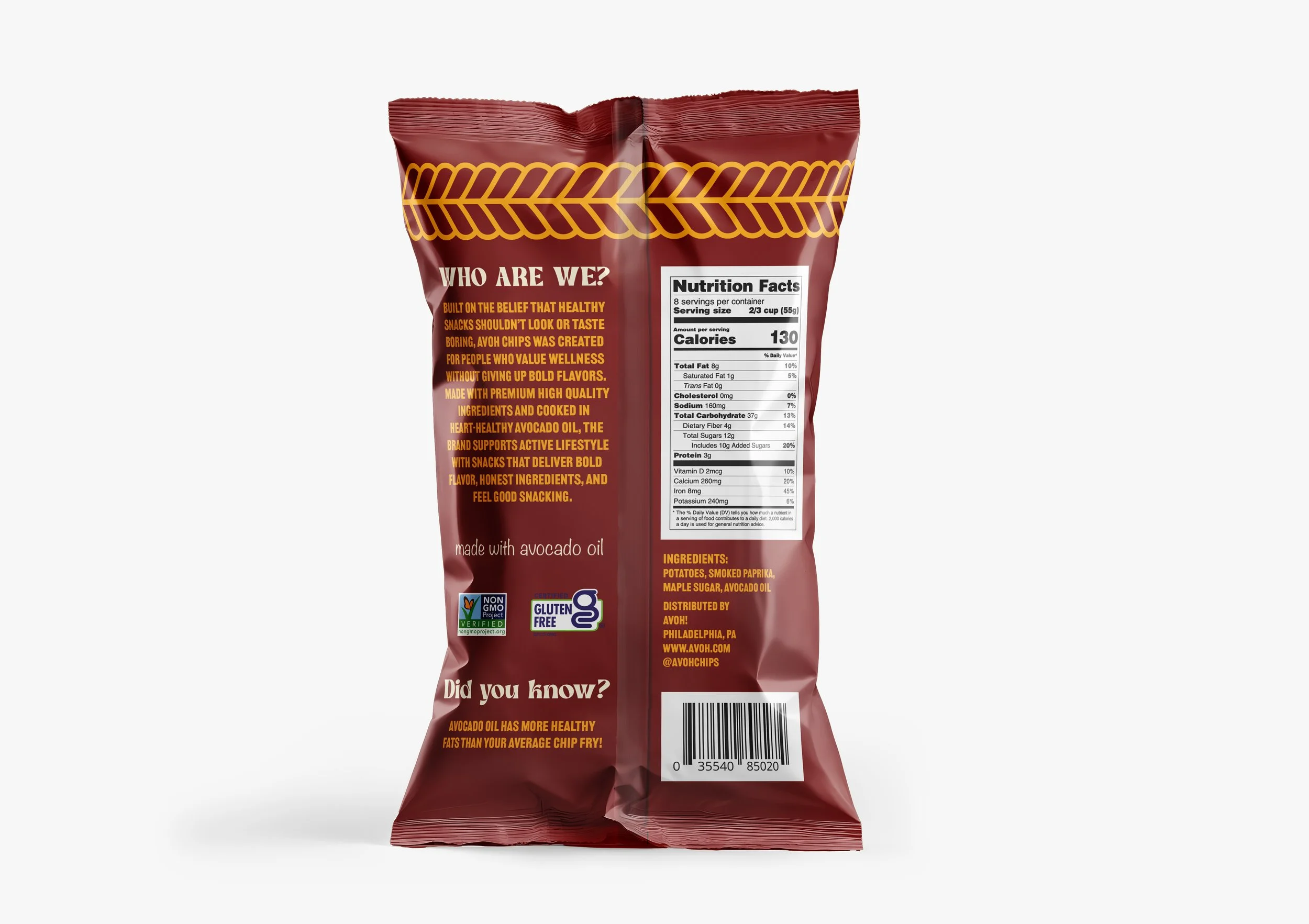
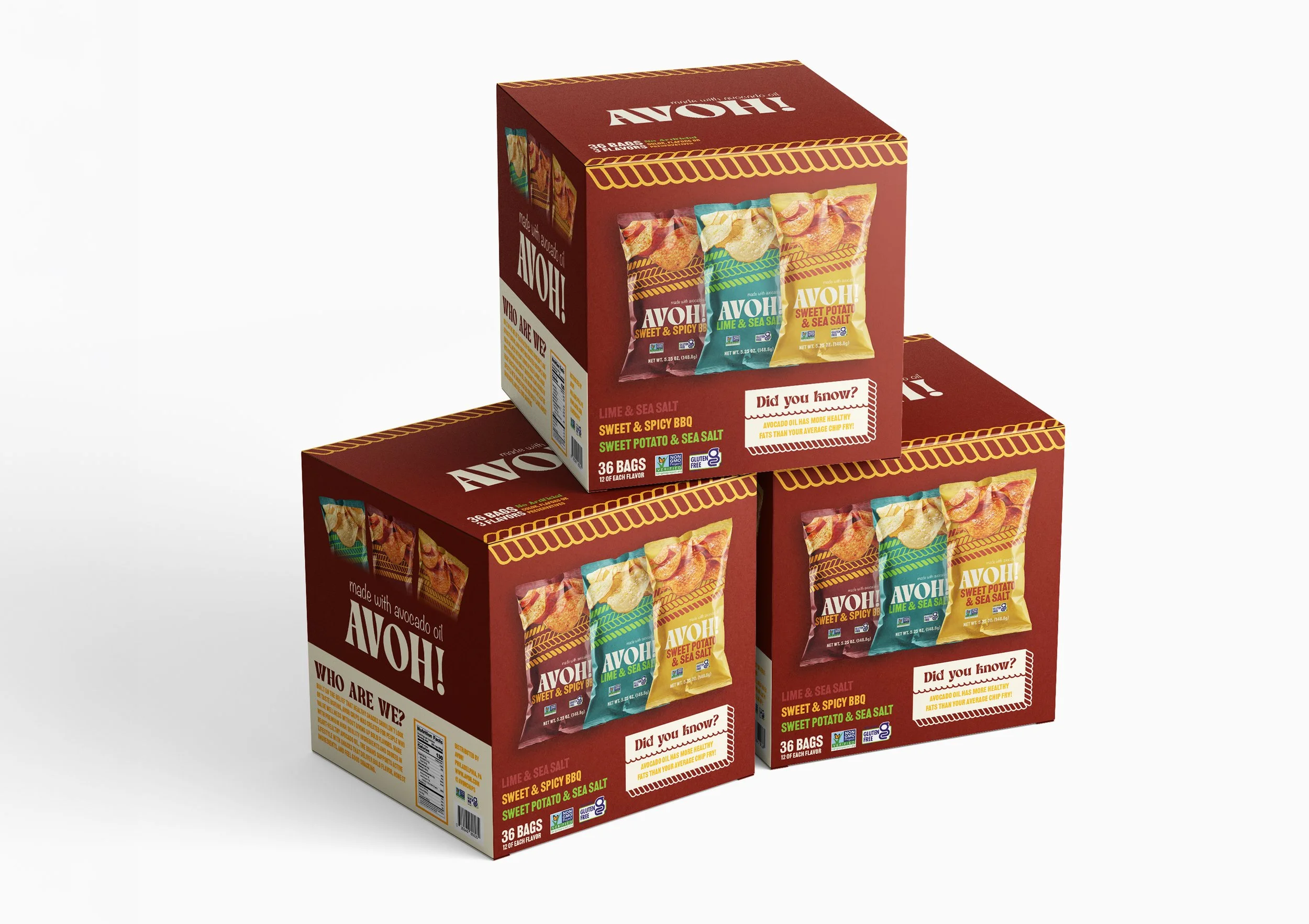
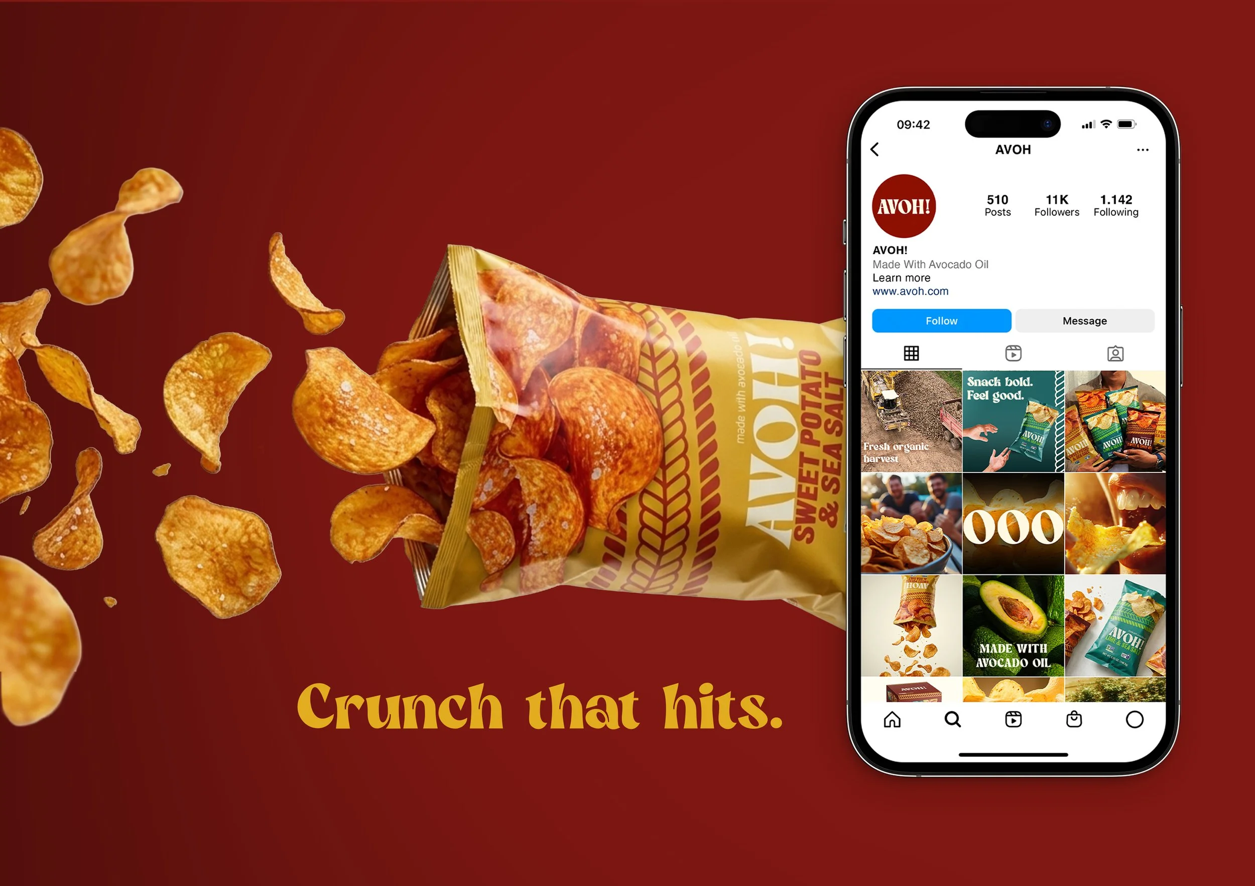
Avoh! Brand Identity
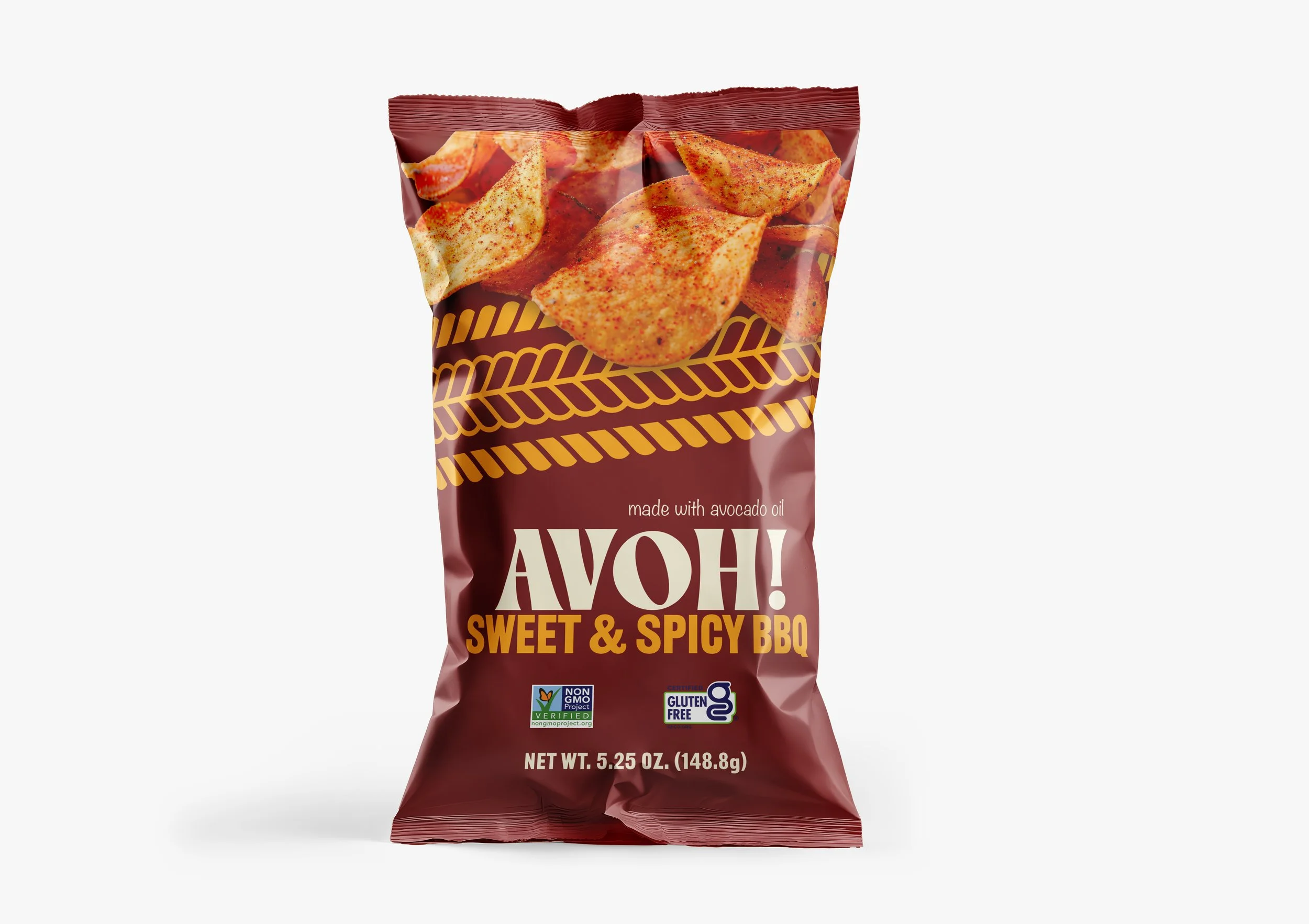
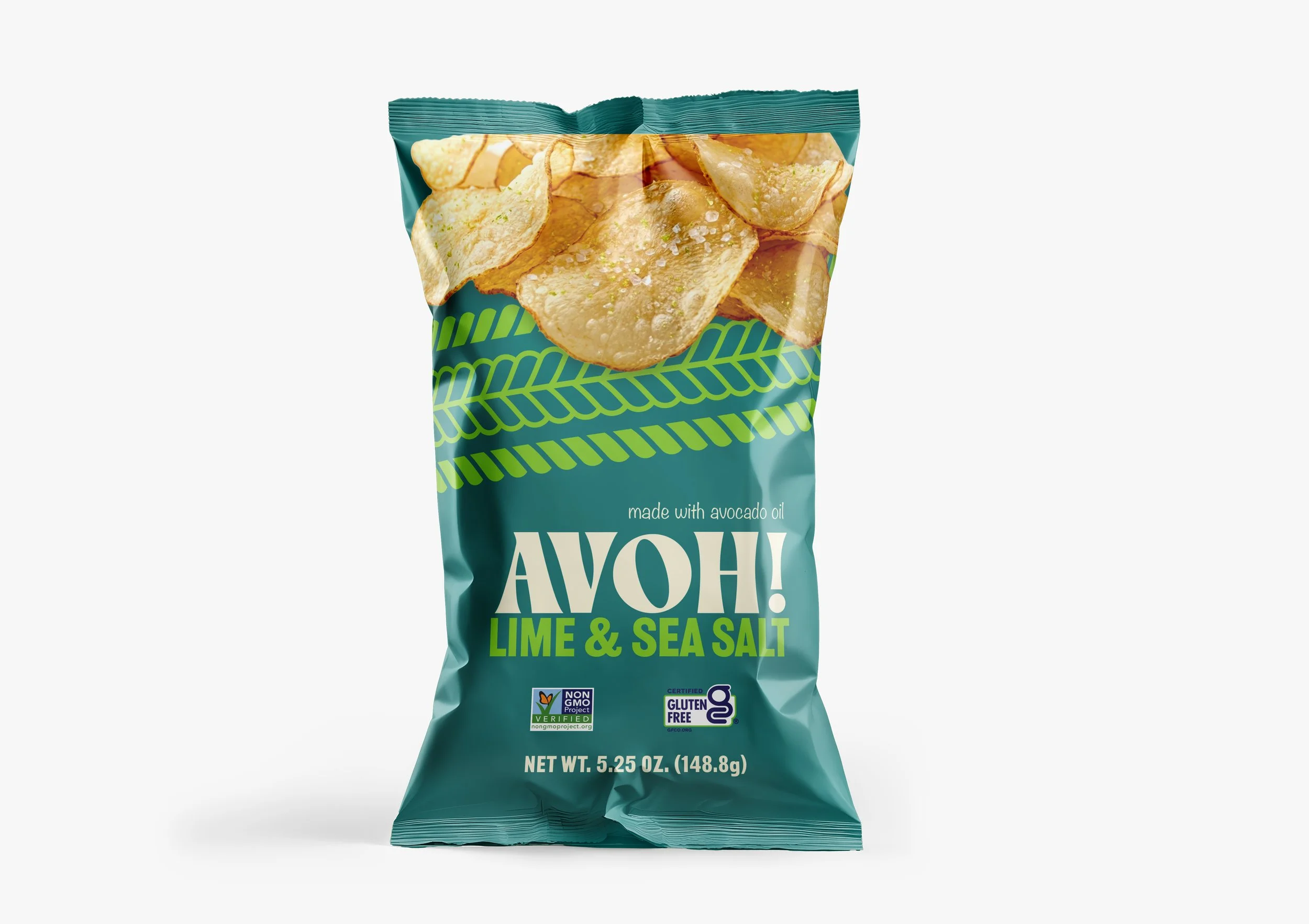
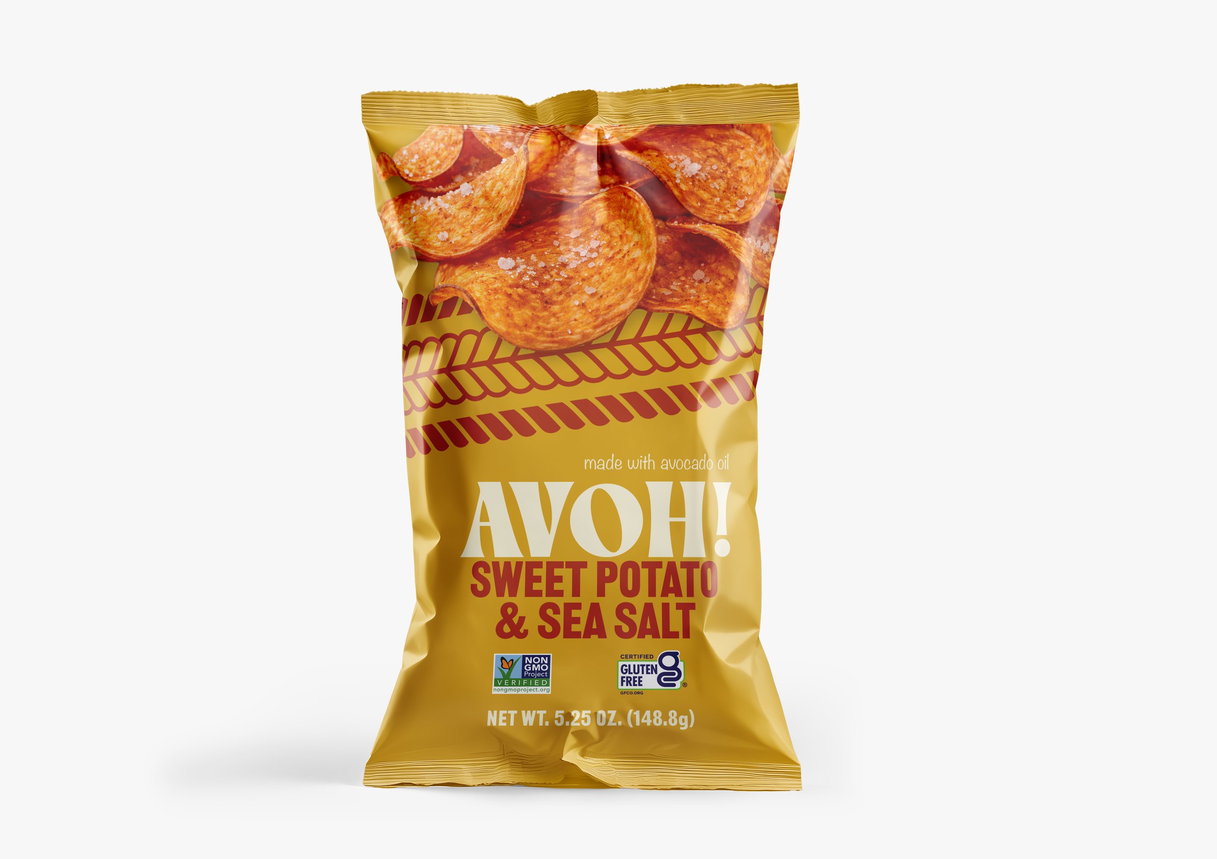
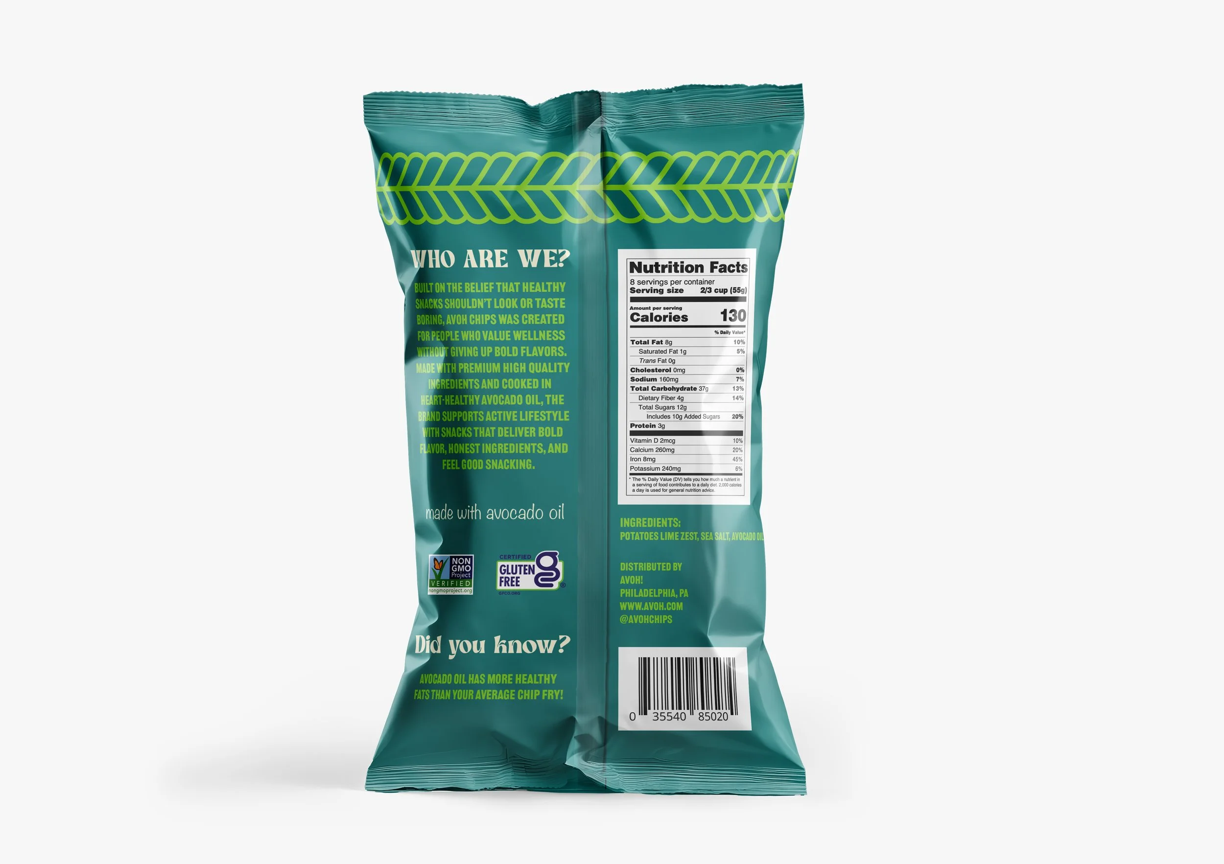
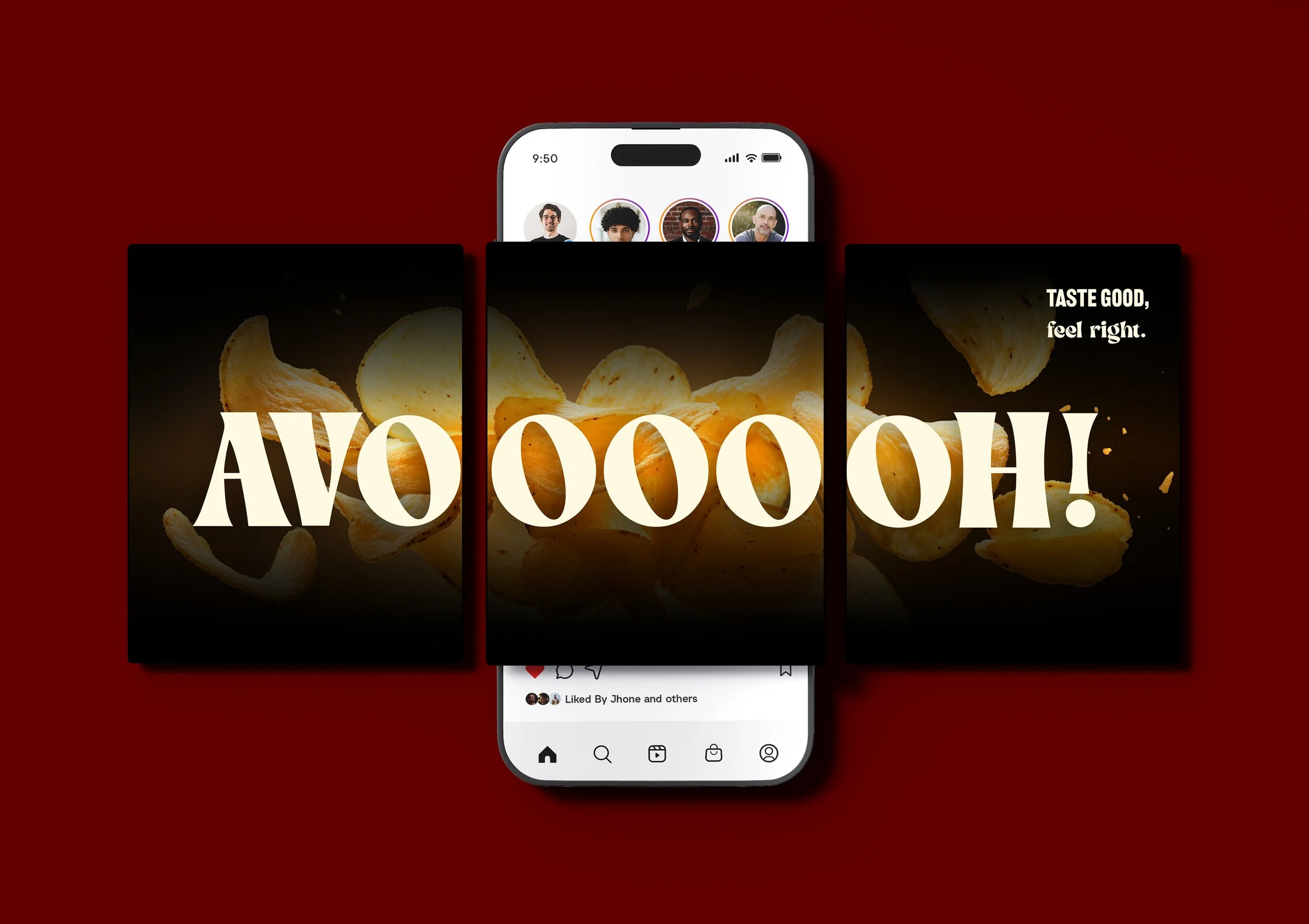
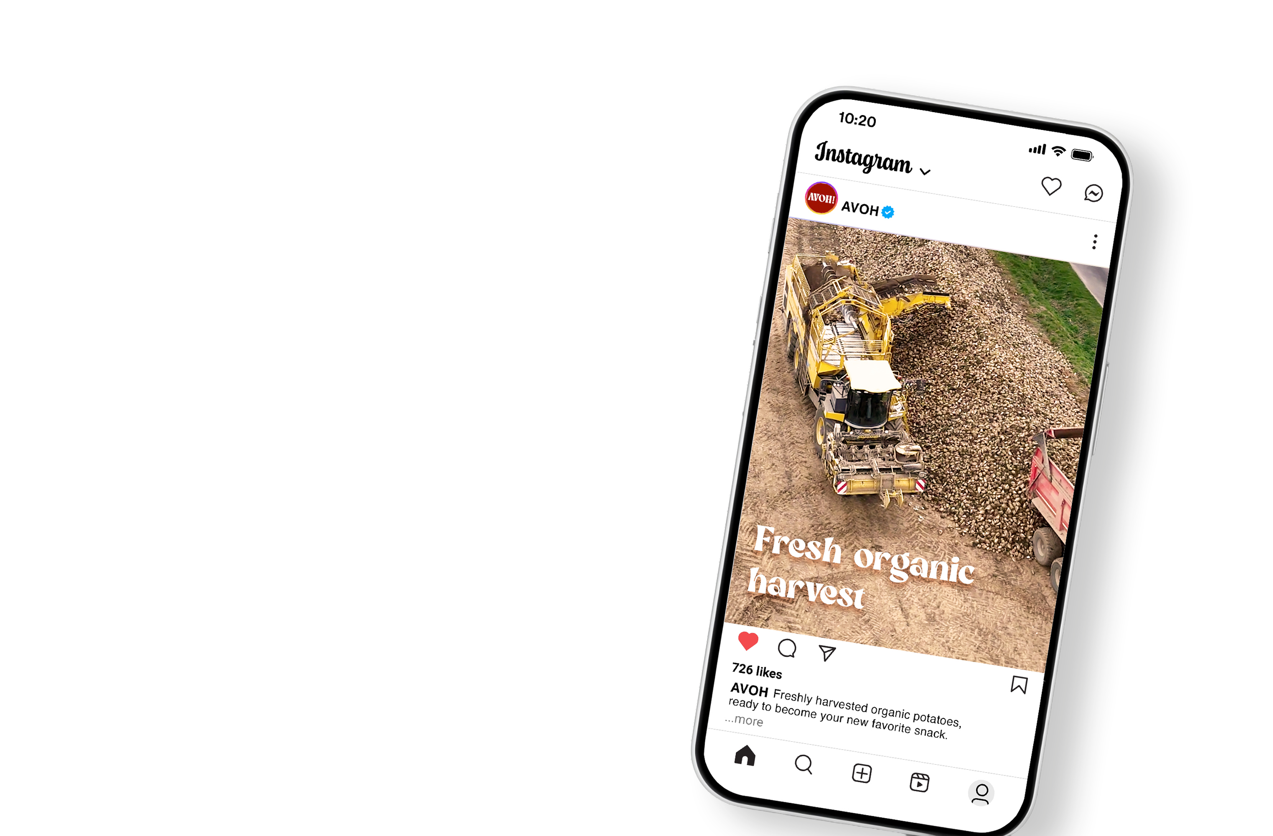
Avoh is a health-focused snack line of avocado oil-based chips, created to challenge the conventional look of “better-for-you” products. While many healthy snacks rely on muted colors and minimal design to signal wellness, Avoh uses bold typography, vibrant color palettes, and dynamic layouts to create a more engaging and memorable presence. The brand identity emphasizes the balance between health and enjoyment, using clear messaging and real ingredient imagery to communicate quality while still feeling fun and approachable. Designed to stand out on crowded shelves, Avoh demonstrates how strategic visual design can reshape expectations around healthy snacking.
Goal
The goal of the Avoh brand identity is to create engaging packaging and visuals that draw people in, even within the healthy snack category. Rather than relying on the muted and minimal approach often associated with wellness products, Avoh explores how bold design can shift that perception. Through expressive typography, vibrant color and dynamic layouts, the identity shows that healthy snacks do not have to feel bland or restrictive. Instead, they can be visually exciting, memorable, and just as appealing as traditional snack brands, while still clearly communicating their health benefits.
Color Palette
Typography
Bright Melody
Railroad Gothic ATF
Noteworthy
Tools
Illustrator
Photoshop